Combine px.imshow and datatables to explore image segmentation
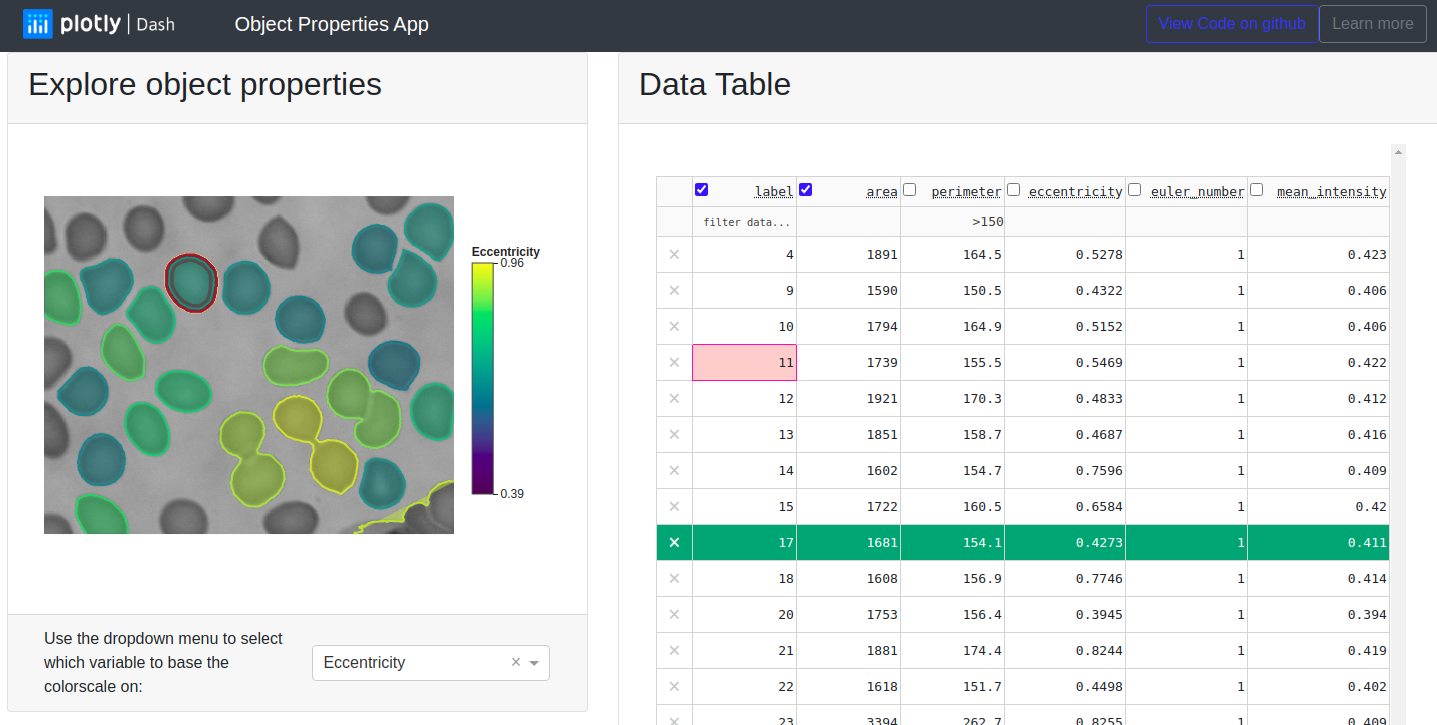
Image processing workflows generate multimodal information that need to be explored and interpreted. For example, with scikit-image we can build a lightweight image segmentation workflow and compute properties of the segmented regions in the image. We may want to look at the segmented regions in an interactive visualization such as plotly’spx.imshow, but we may want to look at the computed region properties in a table where we can sort and search values. Here we have built a Dash app that combines the best of both worlds by interactively linking visual and tabular data.
You can explore this app in the dash app gallery and find the source code in the dash-sample-apps repository on github.
Computing region properties in tabular format
The regionprops_table method in scikit-image allows us to compute the properties of regions in a segmented image and easily display them in a pandas dataframe (see the scikit-image docs for a tutorial on image labeling):
import pandas as pd
import matplotlib.pyplot as plt
from skimage import data, filters, measure

image = data.coins()[10:150, 10:150]
image_label = measure.label(image > filters.threshold_otsu(image))

# Compute properties of the labeled regions
prop_table = measure.regionprops_table(
    image_label, intensity_image=image,
    properties=["label", "area", "perimeter", "mean_intensity"]
)
table = pd.DataFrame(prop_table)
print(table.head())

>>>>>

   label  area   perimeter  mean_intensity
0      1   545  143.018290      172.022018
1      2  1289  273.670094      169.703646
2      3  1088  149.917785      185.149816
3      4     2    0.000000      176.500000
4      5  1286  181.616270      191.275272
Visualizing the segmented data efficiently using plotly express
To look at our segmented image, we can use the px.imshow function from plotly express and then use custom hover labels to also show the computed region properties (see also the related skimage tutorial here):
import plotly.express as px
fig = px.imshow(image, binary_string=True, binary_backend="jpg",)

for rid, row in table.iterrows():
    label = row.label
    contour = measure.find_contours(image_label == label, 0.5)[0]
    y, x = contour.T
    # Now we add custom hover labels to display the computed region properties
    hoverinfo = "<br>".join([f"{col}: {val:.2f}"
                             for col, val in row.iteritems()])

    fig.add_scatter(
        x=x,
        y=y,
        mode="lines",
        fill="toself",
        showlegend=False,
        hovertemplate=hoverinfo,
        hoveron="points+fills",
    )
fig.show()
Notice that we have asked px.imshow to compress the image into a bytestring with the binary_string=True argument in order to keep the amount of data being sent over the network small.
For the same reason we have choosen here to compute the contours of the labeled regions with scikit-image and then add them as Scatter traces with custom hoverinfo to the figure. This approach is very efficient because:
- We do the computation of the region contours on the server and in python where it is fast
- For each region we only need to send very little information over the network:
- the points of the computed contour trace
- a single string with the hover info
We could have achieved a similar outcome in fewer lines of code by using the plotly Contour traces. The downside of this approach is, that not only do we need to send the full labeled image array over the network, we also ask the browser to compute the contours of this labeled array for us. While this solution is acceptable for medium-sized arrays, we get a better performance with our solution for large image arrays and deployed apps.
Interactive Datatable and Dash callbacks
So far we have generated a table with the computed properties of regions in a segmented image and we have created an interactive visualization of this segmentation with a helpful hover information. This already makes it quite easy to understand and explore our data. But there are also some questions we cannot answer easily in this way. For example we might want to know if there are any regions in our image with an area of less than 1000 pixels but with a large perimeter > 200. And we might want to quickly see where these regions are.
The Dash DataTable component allows us to quickly filter the table entries using the DataTable filtering syntax. Filtering the table updates the derived_virtual_indices attribute of the DataTable component to the currently visible row indices, and we can listen for changes of this attribute by using it as an Input to a Dash callback. When the derived_virtual_indices attribute changes, we redraw the interactive figure so that it only shows the overlay for regions that are currently visible in the DataTable .
We also listen for changes to the active_cell attribute of the DataTable component. This attribute is initially None when the app starts but when the user clicks on a cell in the DataTable, active_cell contains a dictionary with the row and column information of this cell. We use this information to draw a red contour around the region that corresponds to the selected table cell.
Hovering over segmented regions the interactive figure changes the hoverData attribute of the plotly figure. We store the label of the curent region in the customData argument of the Scatter overlay so we have access to it inside the callback. We use the region label to find the corresponding line in the DataTable and highlight it in green by updating the style_data_conditional property of the DataTable. Notice that although we do not use customData in our hovertemplate, it is possible to do so to add other data to the hover display.
What’s next?
We hope you enjoyed this app! Suggestions are welcome, and can be submitted via the source repo or on Twitter.
If you need to explore and visualize a large set of labeled regions in an image, you can adapt this open source app for your own purposes.
You might also want to check out some of the other image processing apps in the dash gallery:
- Interactive Image Segmentation
- 3-dimensional image annotation through superpixels
- Interactive image classification with the bounding box app (also check out the corresponding blog post).